In just the first quarter of 2024, mobile devices have generated 58% of web traffic. In fact, 69% of people spend most of their media time on their mobile devices.
But even with these huge numbers, how many times have you encountered a clunky or slow-loading page on your smartphone? How about a page cluttered with text or images that it feels like you spent years just scrolling through to get to the end? How about a sign-up form that was so complicated, you just gave up? Probably too many to count.
Having great web pages, especially landing pages, are important if you want to provide a great user experience for your audience and convert them down the line. This is why we created this guide for you on how to create seamless and easy-to-navigate mobile landing pages.
Let’s get started!
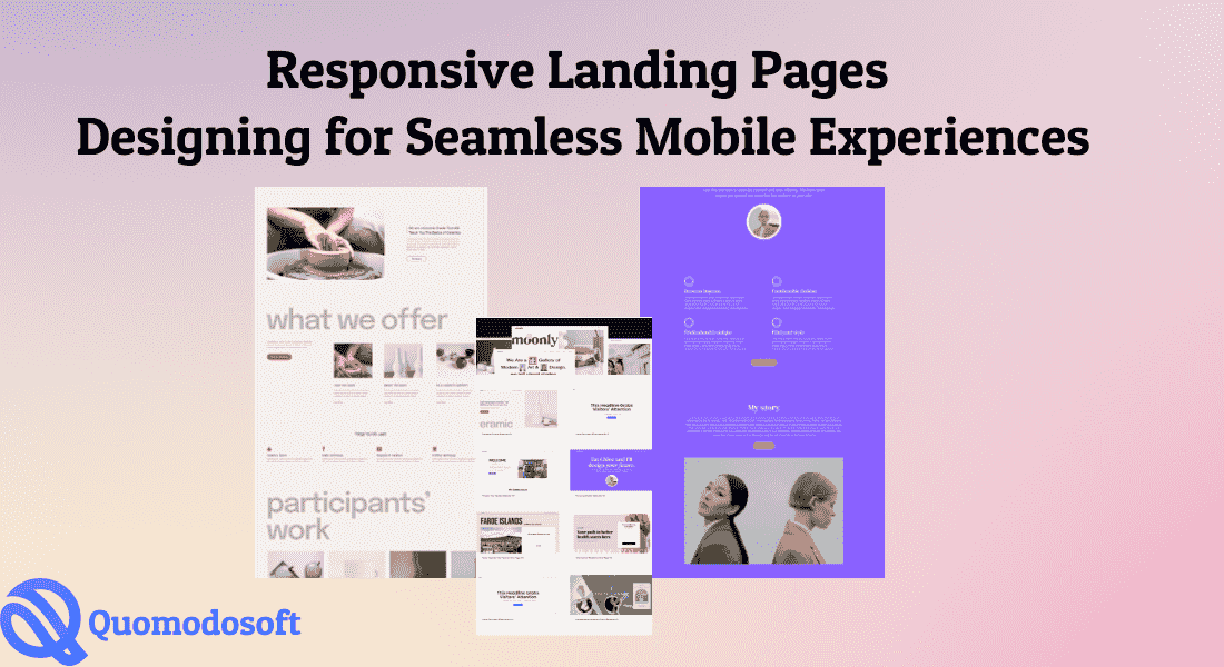
Best Practices for Designing Seamless Mobile Landing Pages
Your landing page is an important factor in your digital marketing strategy, and its mobile version should be in tip-top shape. But even if you can view a landing page on your phone, it doesn’t mean that the page is optimized for mobile.
If you are looking for tips on how to design better mobile landing pages, read on:
A. Design for mobile first
Instead of creating your landing page for desktop and then adapting it for mobile, it’s better to start with your mobile page first.
Why? It’s because mobile pages have more size restrictions and usability concerns compared to desktop pages. Some UI elements or visual choices on desktop might not translate well to mobile. For example, a flashy animation might look good but just makes your page load for ages. Your complex background design might look fine on desktop but is too overwhelming on a small mobile space.
By prioritizing mobile design, designers can immediately discern which features are necessary and which are not, or if they need to add more functionalities to make browsing more seamless. And once you have narrowed down your design to contain only the most crucial elements, you essentially have the core of your UI. It’s then easier to just expand on that for other sizes.
B. Make it responsive
A responsive design, according to Interaction Design Foundation, is “an approach to web design in which the interface adapts to the device’s layout, facilitating usability, navigation, and information seeking.”
To put it simply, a responsive design means your landing page will automatically adjust depending on the device’s screen size or orientation. This means that your landing page will look good and still be easy to navigate, whether you view it on your iPad or iPhone.
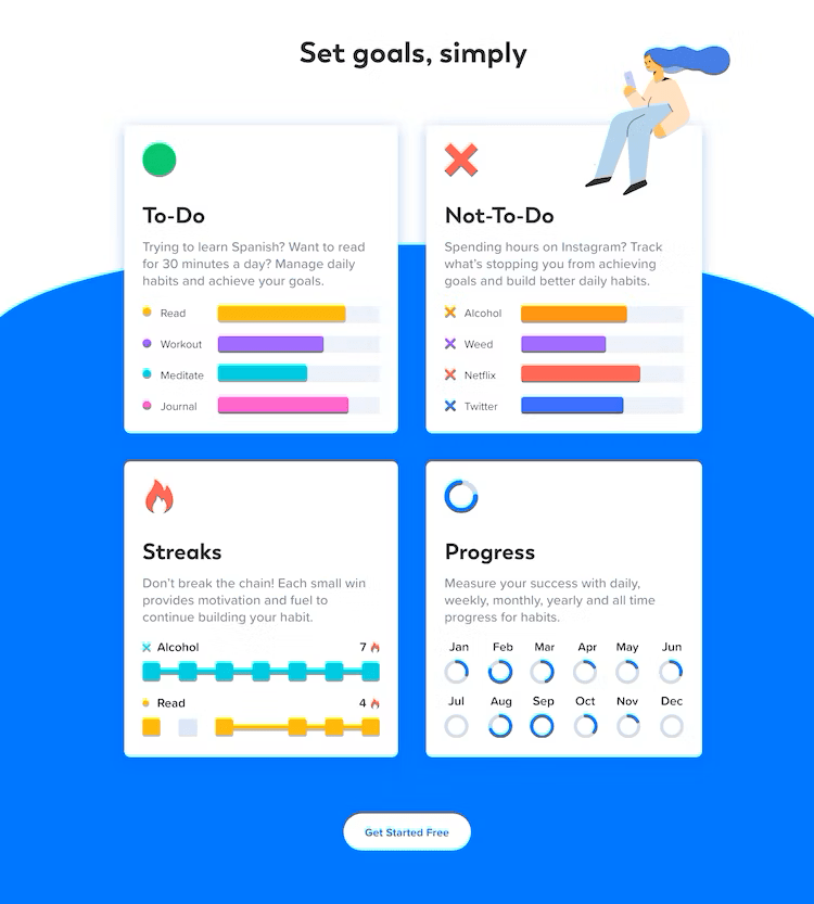
Let’s take a look at Confetti Habit’s desktop landing page.
But with responsive design, it automatically adapts to look like this on mobile:
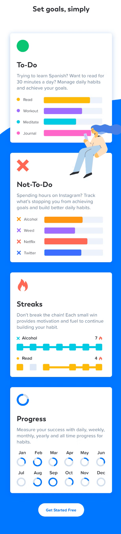
With the never-ending phone releases happening, having a responsive design might just save you from lots of headaches in the future since you won’t have to worry about adjusting your design every single time. How about that for a #LifeHack?
C. Keep it simple

If there’s one word you got to remind yourself while designing your mobile landing page, it’s this – simplicity.
Of course, it’s easier said than done, and with our next few tips you can get more definitive examples of how to keep things simple. But for now, we want you to have simplicity at the forefront of your mind.
Keep your visual design simple — use no more than three fonts, maintain a consistent color palette, use only your logo design as a main branding asset, and avoid overloading the page with images or graphic elements. Simpler designs usually mean faster loading times (which is always a win for mobile pages).
Your sign-up forms should be simple as well. In fact, asking for your audience’s name and email address should be enough. Also, resist the urge to fill your landing page with too much copy, complicated menus, or multiple columns. And speaking of columns…
D. Go for a single-column layout
Want to boost your mobile landing page conversion rate? Consider using a single-column layout.
With the limited space available on mobile, using a single-column layout is the best way to streamline your user’s experience. This is because there is less content (whether text or image) to distract your user with. This means lesser cognitive load, which = better user experience, which = happy customer.
There are many other reasons why single-column format works best for mobile. Some of them are:
● This layout is easier to understand and navigate for users. They will just have to scroll through the page, instead of moving from left to right.
● The layout also draws your user’s eye down the page. They will be more incentivized to go through your whole content and reach your CTA.
● The single-column format will force you to only include the crucial elements. This means your mobile landing page is simpler, has more concise captions, has straightforward navigation, and is overall more optimized for a great user experience.
E. Keep your text short

For mobile landing pages, it’s crucial to make your text concise and straightforward. To do this, minimize fluff, use short sentences, and break up your text into smaller paragraphs.
For your headlines, make them short and snappy. Keeping it to four words or less is best.
You can also use bullet points to summarize key details. This is especially helpful since users tend to just skim pages. Using this is also a great way to visually break up a long paragraph, and make things easier to read for your users.
F. Your CTA matters
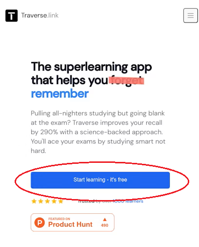
Your mobile landing page’s main goal is to convert users, and your CTA is the most important element to achieve that.
Your CTA should be straightforward. Be clear on what you want your audience to do, and clearly spell it out, ex. “Download”, “Call Now”, “Register Now”. The copy that accompanies your CTA button should also be compelling enough that your audience will want to click it. Focus on the benefits that they will get from you, and make it concise enough that they’ll understand immediately.
In terms of design, your CTA button should have a vibrant color that can easily be spotted on your landing page. Make sure you have a good contrast between the background color and the button color.
In terms of placement, you can either place it at the very bottom (since that’s the natural flow of the page) or near the top (so that it is immediately visible). You can also make use of sticky bars, and have your CTA follow you throughout the page.
G. Think with your thumbs
If you’re like any other human being on Earth, you probably hold your mobile phone in one hand and use your thumb to scroll through.
Which is why you should design your landing page with your thumb in mind. It sounds funny, we know, but it can actually help in making your landing page easier to use and navigate.
How? It means making all your buttons or fill-up forms large enough to be clicked without any issues. Your elements should also be properly spaced out so that you won’t have any accidental clicks (please think of all of us with fat fingers!).
All the important elements should also be within reach of your thumbs, which is usually the center of the page. Avoid placing your CTA on corners or other hard-to-reach places. And since your users are scrolling, don’t make them pinch the screen to zoom in or out just to navigate your landing page.
Wrapping Up
Mobile browsing is not going away any time soon. In fact, we may see an even bigger increase of it in the future. If you haven’t optimized your web pages for mobile use, you might regret it.
This is particularly true for your landing pages. After all, it’s your main tool for increasing conversion rate and lead generation. Creating great mobile landing pages is crucial if you want to boost your business.
Our tips above should be a great start for your landing page journey. You can also take a look at some landing page examples for inspiration, or read through this case study if you want to get more ideas.
Until next time!